This is my blog about my growth and journey in drawing and art in general. My goals, success's, and my frustrations with the technical aspects of it all. Since I am going for a AA Degree in Visual Arts, 3D Design and need to take some more general education classes to get it, writing this blog might just help me practice my writing skills.

Thursday, April 28, 2011

Another week of class's

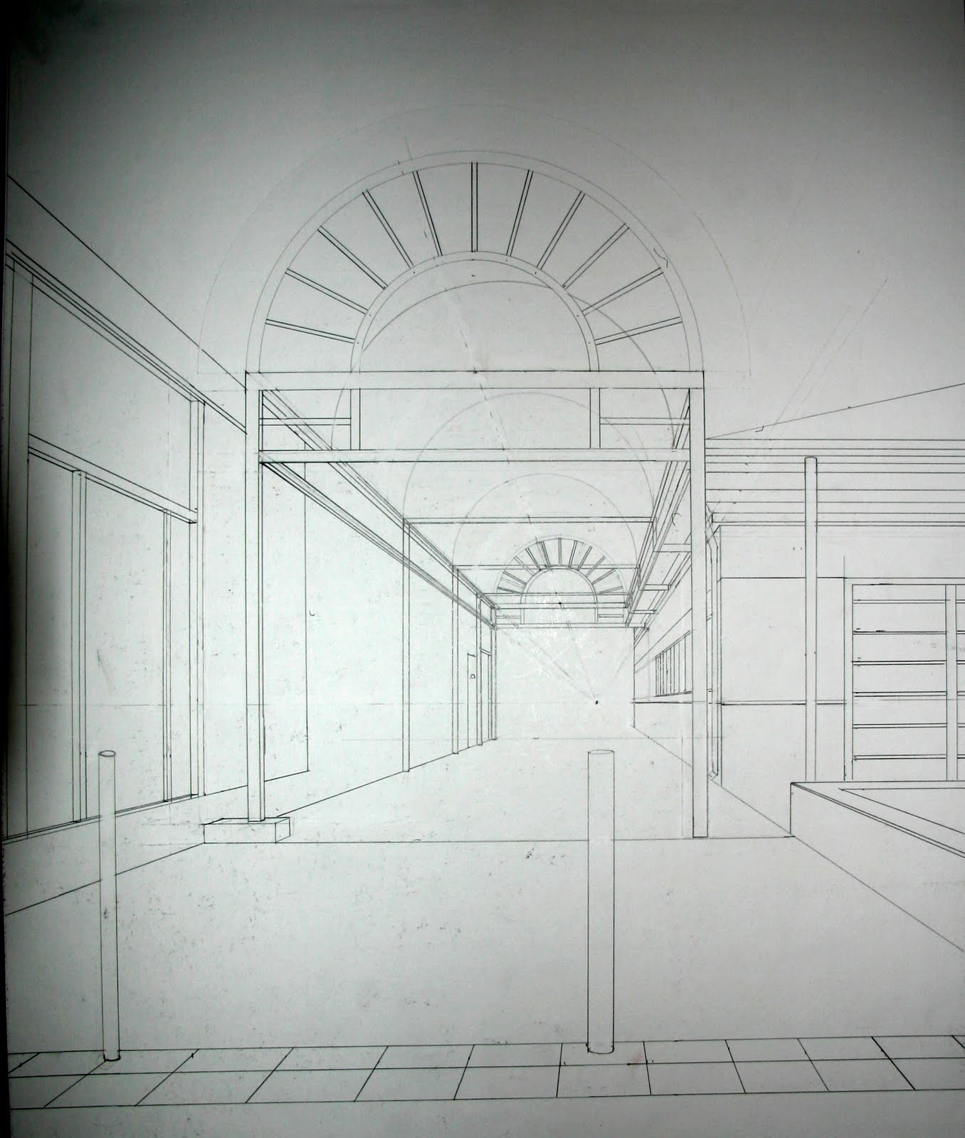
Had a good drawing 1 class working on 2 point perspectives. I am very happy with my progress with it once I got the hang of it. Here are a couple of homework projects for that class. Unfortunately I did not score the highest on this first one I only got 5 extra credit points not 10. I was not creative enough with my boxes, just more clear and filled up the space better. Oh well. I guess my new mantra I should be saying over and over should be "Loosen up and get more creative, Loosen up and get more creative" Hmm

2 Point Perspective Graphite on Paper 18x24

2 Point Perspective Homework. Still need to add more items


I am not so happy with my life drawing class. It was alternate media day (Bah! or maybe that is the wrong attitude, lol) I need to loosen up and get more creative. I brought in cardboard and a type of wood paper for the surfaces and make-up and chalk for pool cues to use as the medium. I did not really enjoy my choices too much. My first drawing on the cardboard with make-up I can't stand so I tossed it. The wood paper was fantastic but my use of the cardboard sucked, just my opinion. Some other class mates did a fantastic job with just trash. Damn them, lol. I did try to loosen up and do some expressive figure drawing and I did like the outcome on a couple of my drawings with soft pastels. My proportions are definitely off but I like the effect on this first drawing.  The clear coat did effect the brightness of the pastels. I did not like the second soft pastel drawing that much due to not getting the twist in her body correct.

Soft Pastel on Wood Veneer Paper 16x25
Soft Pastel on Pastel Paper 18x24

Oil pastels were a bit more challenging for me though. I will need to keep trying to use them to see if I like them. I do not like this either of these and the yellow craft cardboard was a pain to draw on. But it was an experience that was at least for me an experiment.  I am going to keep trying the watercolor washes, I do like the effect. I still have to do 2 india ink drawings and I think they would look good on a washed background.

Oil Pastel on Watercolor Paper with wash 18x24

Oil Pastel on Cardboard 18x24


Thursday, April 21, 2011

Perspective Studies for Homework

Well it was a good week in my class's. Actually got a 'B-' on my art history midterm, I was expecting a 'C'. It always feels good to get a better grade than what I was expecting. Getting a 'B-' on my life drawing museum report was great also.
We've been working on linear perspective in my Drawing 1 class. I feel much more confident in this class than life drawing. My background in drafting and design really helps out in it. Here is some of my homework on perspective.

1 Point Perspective Homework Graphite on 18x24 Paper

1 Point Perspective Homework Graphite on 18x24 Paper

2 Point Perspective Homework Graphite on 18x24 Paper, Still need to add more boxes
 
and from my Life drawing class from last night.

Conte Charcoal on 18x24 Tan Pastel Paper

Soft Pastels on 18x24 Ivy Pastel Paper

Monday, April 18, 2011

Some of the Landscapes I Designed

Well since I did landscape designs for over a decade I guess some of them should qualify as artistic or creative. I love designing waterfeatures and pools. To think of something in my head, put it on paper, then see it being built and then finished is really cool (at least when the owner can afford to let it be built, lol). Here are just a few of them that I designed. Click on the pictures to see them better.

Before starting not the play area the kids liked

During Construction (Guniting) and rebar & plumbing work on waterfalls

Finished! Now the kids will want to stay home and play.

37' Long Waterfall/Stream

30'x50' Pond for his Koi

Finished lap pool in small yard

Water Features

Sheer Rain in Concrete Bridge

Nice Back Yard with pre-fab spa and raised patio

Raised covered patio sitting area

Nice pond with stepping stones to fire pit

Nice pond for relaxing. White structure was there before we started

Before construction, Owner wanted bigger spa and shallower pool

10 person spa with grotto and counter, also a baja shelf

His BBQ/fire pit area for entertaining with all the toys

The Brewery ArtWalk

This weekend I went to The Brewery ArtWalk in L.A. It was a very hot 90 degrees and a lot of walking but it was a lot of fun meeting and talking to artists in their studios. Some of my favorites were: Ann Erpino which has fantastic creative paintings.  Lets Play Dead who's dolls are fascinating. Ted Meyer I really liked his figurative paintings, they were very very good, but his series on scars really moved me and made me think. My scars are a lot smaller than some of the other peoples scars. I'm lucky that I didn't have to go through what some of them did with their scars. Scott Miller had some fantastic sculptural flowers on masonite. Bruce Grey sculptures were great and creative.  Victoria Sebanz photos were beautiful and here mixed media was very interesting. She explained what influenced her with the pieces and that she took the time to explain it was very nice of her. It was overall a very inspiring day. If you have a chance to go to the next one, you really should do it.
Here are a few cards I picked up.


Friday, April 15, 2011

Tone Study

Tone Study Graphite on Paper 9"x12"
Here is a drawing I've been working on for a couple of days. It is a study for tonal gradation.
The photo and photoshop work did not work very good, it is somewhat smoother in gradation.

More of my Ceramics

Here are some of my ceramics I made them around 1999-2000. I always did like throwing large plates and bowls.

Raku Plate 14"

Raku Plate 13"

Raku Bowl 14"

Stoneware Bowl 15" Red Glaze with Rutile wash on rim

Stoneware Vase with Ash Glaze 11"
I did not make this flower bowl, another student did. It is one of my favorite pieces though.
Flower Shaped Stoneware Bowl 14"

Wednesday, April 13, 2011

Tonal Drawings

Tonal Pot
Did two drawings using tonal values. Blacken the background and then lighten and darken to bring out the values. I think the pastel paper is too rough, it was hard to remove the background with the chamois. Have to try this again with charcoal paper when I get some.
The exercises are out of the book:

Life Drawing in Charcoal
by Douglas R. Graves

Tuesday, April 12, 2011

The Gallery Weekly Subject 'Tomorrow'

Tomorrow is here
The subject 'Tomorrow' is interesting. I've been hiking up this trail the last couple of weeks up in Griffith Park and when I get to this one trail by the old dump I've been turning around and telling myself I'll go farther tomorrow. lol,


Mt. Hollywood Marker
Well I guess tomorrow finally got here with a little push for the photo subject. I kept walking and made it to the top of Mt. Hollywood again, only took me a couple of months to get back up here.


A Hazy Downtown L.A. Skyline
It was a nice hazy L.A. day, not too hot yet. Guess I will have to make it all the way up again tomorrow, lol.

Hollywood Sign from a different angle or is it the Ollywod sign

Monday, April 11, 2011

Modified Conte Drawings

 Well I tried to fix the hair, it does look better. Also darkened the background. This is too light with grey conte
I think I like it darker, it pops the highlights and mid-tones(paper color) more that way. Didn't leave her highlights on her neck, oops.

Conte Charcoal Drawing

Conte Charcoal on Tan Pastel Paper 18"x24"
Well, charcoal is still tough for me. I guess I am wound up too tight, I need to loosen up while I'm drawing. Too many years using T-squares and triangles I guess, lol. Practice, practice, practice is the only way to get through it. It is better than some of my other charcoal drawings, just need to back up away from it and it gets better, I guess that's why the instructor keeps saying to back up and take a look at it. The farther the better, lol. but I don't think that hair will get any better at all though. Shouldn't try to make it like I do with pencil, maybe just light and dark areas.


Here is a couple of pictures of a bowl I made about 1999 using B-Mix with sand and a Celadon glaze. It is one of the few I carved. I will post more of them when I can take their pictures. The ones I kept anyway. Sold most of them at the student sale every semester. I do have a few of my Raku pieces in storage. I think I only have one piece of jewelry that I made, maybe some of my family members still have the ones I gave them.

Ceramic Bowl 15.5" diameter

Ceramic Bowl Bottom

Sunday, April 10, 2011

Another hair study

Graphite & colored pencil on paper 9"x12"
Well, since I am doing one drawing a day on areas I need to improve, here is the one for today. I think I am getting the hang of hair, but I think the hair should have had one grouping below the ear and the rest above. Oh well tomorrow is another day. I think I will try conte charcoal tomorrow full size 18"x24".

Friday, April 8, 2011

Hmmm, First Post with an Eye Study

Graphite on paper, 9"x12"
Well been in my art class's for 8 weeks now. Just had my midterms and I think I bombed on my art history test, well should get a C at least. Love the class though. Just got done studying the Renaissance. My favorite artist (Rembrandt) should be up in a chapter or two. Drawing 1 class is going great, my drafting experience is very helpful in this class at least. Ah but my life drawing is really fun but a lot more challenging for me. Getting those proportions down has been hard, those damn heads, hands and bodys, lol. They look like I am a Mannerist or something. I just tried soft pastels for the first time on my midterm last Wednesday, maybe not the best move i've made, but it was fun experimenting with color. It came out very colorful to say the least so I need a lot more practice with those. Just did a eye study and will post it, I'm not real happy with the scanned image, the contrast/brightness adjustments left some of the detail out. I think I will darken her hair but at least it is not flat looking. But over all I don't think it is too bad for drawing people for 8 weeks. lol. If you have feedback, leave me a comment.